Alternate Text for STEM Examples
Alternate Text
- Graphs
- Complex Data Tables
- Charts
- Diagrams
- Chemical Element
- Comparing Complex Objects
- Flow Chart
- Complex Flow Charts
- Bar Graph
- Scatter Plot
We have compiled multiple resources; for more examples, review Image Description Guidelines.
Overview
Alternate text is best used when MathML is not an option. Students who are blind or low vision may require the use of tactile graphics. It is important to determine what the student learning outcomes are for a given project, and in cases where the answer might be in the alternate text, it might be necessary to rewrite the question differently.
Alternate text is best used with MathML is not an option. Students who are blind or low vision may require the use of tactile graphics. It is important to determine what the student learning outcomes are for a given project, and in cases where the answer might be in the alternate text, it might be necessary to rewrite the question differently. The University of Washington has provided an informational guide on Making Science Labs Accessible to Students with Disabilities. Links to an external site.
Goal: This page provides several alternate text samples. After reviewing this page, participants will be able to write a complex alternate text for images based on samples provided.
Image Description Principles
Validity
Brevity
Clarity
Language Complexity
Drill-Down Organization
Graphs
Adapted from the Diagram Center Links to an external site.
Guidelines:
- Give a brief overview of the picture, i.e., a basic illustration with an embedded graph, and then provide the detail.
- Avoid describing extraneous visual information, ex., one lizard is perched on a rock, there are six lamps on a beam.
- Determine if the graph can be sufficiently summarized in a sentence or two. If not, provide the data in a table with row and column headings.
- There are numbers in parentheses that are not explained in the caption or the surrounding text in the graph. They should not be ignored in the description. Include them but do not guess at or assume their meaning.
Description:
| Degrees Celcius | 1 Day | 2 Days | 3 Days | 4 Days | 5 Days | 6 Days | 7 Days |
|---|---|---|---|---|---|---|---|
| 42°C (24) | 100% | 95% | 95% | 90% | 85% | 80% | 75% |
| 40°C (12) | 85% | 77% | 73% | 65% | 65% | 65% | 65% |
| 38°C (36) | 60% | 40% | 35% | 30% | 25% | 25% | 25% |
| 36°C (12) | 30% | 30% | 25% | 25% | 25% | 25% | 25% |
| 30°C (12) | 10% | 5% | 0% | 0% | 0% | 0% | 0% |
Complex Data Tables
Guidelines:
- While this table is complex with several headings layers, it can be broken into three separate tables under the headings: Motor vehicle traffic, Firearm suicide, and Firearm homicides.
- Providing three separate tables will aid in navigation and comprehension.
- The table includes two reference notations: a hyphen representing Quantity zero and a superscript, one indicating that SE stands for standard error. To avoid confusion in the tables below, the superscript one and the hyphen were simply replaced with the words “Quantity zero” and “standard error.” This is an example of providing greater clarity as opposed to mimicking the exact visuals of the table.
- If desirable, this complex table may also be replicated exactly through proper HTML coding.
Description:Figure 9 is a table titled “Average annual weighted number of deaths and percent distribution of deaths by body region of injury, for motor vehicle traffic accidents, firearm suicides, and firearm homicides: the United States 2003-2004.” For better navigation, the table has been separated into three tables:
| Body region | Number of deaths | Percent distribution | Standard Error (percent) |
|---|---|---|---|
| Total | 43,386 | 100.0 | Quantity Zero |
| Head and neck | 13,862 | 32.0 | 0.3 |
| Torso | 7,382 | 17.0 | 0.3 |
| Other specified | 911 | 2.1 | 0.3 |
| Spine, upper back | 492 | 1.1 | 0.3 |
| Extremities | 410 | 1.0 | 0.3 |
| Unclassifiable by body region | 14,691 | 33.9 | 0.3 |
| Unspecified | 6,540 | 15.1 | 0.3 |
| Body region | Number of deaths | Percent distribution | Standard Error (percent) |
|---|---|---|---|
| Total | 16,829 | 100.0 | Quantity Zero |
| Head and neck | 12,428 | 73.9 | 0.3 |
| Torso | 2,211 | 13.1 | 0.5 |
| Other specified | 28 | 0.2 | 0.5 |
| Spine, upper back | 13 | 0.1 | 0.5 |
| Extremities | 14 | 0.1 | 0.5 |
| Unclassifiable by body region | 67 | 0.4 | 0.5 |
| Unspecified | 2,094 | 12.4 | 0.5 |
| Body region | Number of deaths | Percent distribution | Standard Error (percent) |
|---|---|---|---|
| Total | 11,772 | 100.0 | Quantity Zero |
| Head and neck | 3,714 | 31.5 | 0.5 |
| Torso | 4,005 | 34.0 | 0.5 |
| Other specified | 397 | 3.4 | 0.6 |
| Spine, upper back | 33 | 0.3 | 0.7 |
| Extremities | 363 | 3.1 | 0.6 |
| Unclassifiable by body region | 2,685 | 22.8 | 0.6 |
| Unspecified | 972 | 8.3 | 0.6 |
Diagram Sample
Guidelines:
- Break the information into a bulleted list for easier navigation.
- Spell out abbreviated units for clearer audio pronunciation.
- Describe the parts of the image rather than explain the concept. That is done in the surrounding text.
Description:
- Two diagrams show vectors on a number line. Diagram A shows a number line that goes from 0, the start, to 6, the finish. A vector arrow goes from 0 to 4 and is labeled 4 kilometers. Another vector arrow goes from 4 to 6 in the same direction and is labeled 2 kilometers. The diagram represents the equation: 4 kilometers plus 2 kilometers equals 6 kilometers.
- Diagram B shows a number line that goes from 0, the start, to 4. In the middle of the number line, 2 is the finish. A vector arrow goes from 0 to 4 and is labeled 4 kilometers. Another vector arrow goes from 4 to 2 in the opposite direction and is labeled 2 kilometers. The diagram represents the equation: 4 kilometers minus 2 kilometers equals 2 kilometers.
This image in context:
- The diagram is used after the concept is introduced.
- Captions explain the concept very clearly.
Chemical Element Example
Guidelines:
- When describing one element from the periodic table, write out the four property labels in narrative form listed in the periodic table, from top to bottom. See Description 1.
- If the information required is about the elements' properties, change the order of the information to put the chemical name first, then list its properties. See Description 2
- When listing two to three elements, use a bullet format. When listing three or more elements, use a table format for easier navigability. The property labels of the element would be listed across the top as a header.
- When a screen reader reads an element symbol, it may not pronounce that symbol correctly. If that is a concern, an option to prevent that from happening is to use all caps and put a space or punctuation between the letters. For example, the symbol for Chlorine could be written as C L, or C, L.
Description 1:
A diagram shows properties for the element Chlorine from the periodic table of elements. Atomic number, 17. Element symbol, Cl. Element name, Chlorine. Atomic mass, 35.453.
Description 2:
An element from the periodic table. Element name, Chlorine. Atomic number, 17. Element symbol, Cl. Atomic mass, 35.453.
This image in context:
- This image appears at the beginning of the section.
- The caption explains four pieces of information about an element on the periodic table of elements.
- In context, Description 1 would work best.
Comparing Complex Objects
Guidelines:
- The various relationships between the finches can be replicated in a table.
- This is a case in which the table requires more work to discern the relationships than the illustration. A b/vi person would have to review the table several times to establish the sighted person's patterns almost instantly. However, the table does allow for a quick review of data that a narrative-style description would not.
- This table, like all tables, can be rendered differently. In this case, the alternate would be to have the categories run down the left-hand column instead of across the top row.
- If the finches’ feathers' colors are important, an additional column can be added to the table.
Description:
An illustration showing 10 different finches and their variations is depicted in the following table.
| Name | Finch | Bill | Food |
|---|---|---|---|
| Vegetarian tree finch | Tree finches | Parrot-like bills | Fruit eaters |
| Large insectivorous tree finch | Tree finches | Grasping bills | Insect eaters |
| Small insectivorous tree finch | Tree finches | Grasping bills | Insect eaters |
| Woodpecker Finch | Tree finches | Probing bills | Insect eaters |
| Warbler finch | Warbler finch | Probing bills | Insect eaters |
| Cactus ground finch | Ground finches | Probing bills | Cactus eaters |
| Sharp-beaked ground finch | Ground finches | Crushing bills | Seedeaters |
| Small ground finch | Ground finches | Crushing bills | Seedeaters |
| Medium ground finch | Ground finches | Crushing bills | Seedeaters |
| Large ground finches | Ground finches | Crushing bills | Seedeaters |
Flow Chart
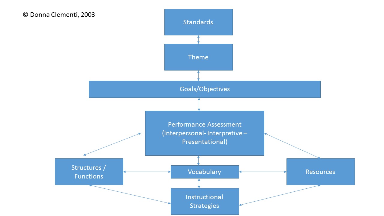
Guidelines:
- Flow charts are a common method of presenting information and one of the most difficult images to describe.
- Simple flow charts can be converted into nested lists with good results. Present the “boxes” as numbers and the possible transitions as sub-bullets.
- For some people, combining descriptions with a tactile version of a flow chart facilitates comprehension.
- It is not necessary to describe the charts' visual attributes, e.g., yellow boxes, curved arrows, etc. unless there is an explicit need such as an exam question referring to these attributes.
Description:
The figure is a flow chart with eight labeled boxes linked by arrows. The chart is multi-directional. At each step, arrows point forward to one or more boxes and back to the previous box or boxes. Here the flow chart is described as lists in which the possible next steps are listed beneath each box label.
- Standards
- forward to Theme
- Theme
- back to Standards
- forward to Goals/Objectives
- Goals/Objectives
- back to Theme
- forward to Performance Assessment
- Performance Assessment (Interpersonal – Interpretive – Presentational)
- back to Goals/Objectives
- forward to Structures/Functions
- forward to Vocabulary
- forward to Resources
- Structures/Functions
- back to Performance Assessment
- lateral to Vocabulary
- forward to Instructional Strategies
- Vocabulary
- back to Performance Assessment
- lateral to Structures/Functions
- lateral to Resources
- forward to Instructional Strategies
- Resources
- back to Performance Assessment
- lateral to Vocabulary
- forward to Instructional Strategies
- Instructional Strategies
- back to Structures/Functions
- back to Vocabulary
- back to Resources
Complex Flow Chart
Guidelines:
- This illustration shows a process. One way to make this accessible is to lay out the steps in a list, similar to the recommendation for flow charts.
- Again, the illustration itself is colorful and visually interesting, but it doesn’t provide additional information beyond the data.
Description:
The Krebs Cycle is depicted as a linear reaction that leads down into a cyclical reaction. Here, the steps of the reactions are presented as lists.
- Linear Reaction
- Pyruvic acid, a 3-carbon compound.
- One carbon molecule is lost as part of a CO2 molecule.
- A NAD-positive molecule enters the reaction, then leaves as NADH.
- A 2-carbon acetyl group remains.
- Coenzyme A, or CoA, joins the 2-carbon acetyl group to form Acetyl CoA.
- CoA leaves the reaction as it delivers the acetyl group to the circular reaction.
- Circular Reaction
- The two-carbon acetyl group joins a four-carbon compound to form a 6-carbon compound, citric acid.
- Carbon is lost as CO2.
- NAD-positive enters, then leaves as NADH.
- A 5-carbon compound remains.
- Another carbon is lost as CO2.
- NAD-positive comes in and leaves as NADH.
- ADP comes in and leaves as ATP.
- A four-carbon compound remains.
- FAD comes in and leaves as FADH2.
- NAD-positive comes in and leaves as NADH.
- At the top of the circular reaction, a two-carbon acetyl group from the linear reaction enters, forming the 6-carbon citric acid at the beginning of the cycle.
Bar Graphs
Guidelines:
- Bar graphs should be converted into accessible tables.
- Briefly describe the graph and give a summary if one is immediately apparent.
- Provide the title and axis labels.
- It is not necessary to describe the bars' visual attributes, e.g., dark blue, light blue unless there is an explicit need such as an exam question referring to the colors.
Description:
Figure 1 is a bar graph that measures vaccination coverage percentage in five states over one year, from Q3 2006 to Q2 2007. In each state, the coverage increases over time. The data are summarized in the following table. All data are approximate.
| blank space | Arizona | District of Columbia | Michigan | Minnesota | Montana | Oregon |
|---|---|---|---|---|---|---|
| Q3 2006 | 35% | 10% | 5% | 0% | 15% | 20% |
| Q4 2006 | 45% | 30% | 33% | 25% | 27% | 27% |
| Q1 2007 | 50% | 45% | 42% | 35% | 37% | 45% |
| Q2 2007 | 65% | 48% | 50% | 41% | 40% | 44% |
Scatter Plots
Guidelines:
- Scatter plots are among the more difficult graphs to describe, especially if there is a need to make specific data points accessible.
- Provide the title and axis labels.
- Identify the image as a scatter plot and focus on the change of concentration.
- If it is necessary to be more specific, convert the data into an accessible table.
Description:
The graph is a scatter plot entitled “Rainfall and Plant Growth.”The horizontal X-axis shows Average Rainfall ranging from zero to four thousand, in units of millimeters per year, in increments of one thousand. The vertical Y-axis shows Plant Tissue Production in units of grams per meter squared per year, ranging from zero to three thousand, in increments of five hundred. The graph has approximately 85 points scattered in a pattern beginning in the lower-left corner where Plant Tissue Production and Average Rainfall are the lowest. The pattern extends toward the upper-right corner where Plant Tissue Production and Average Rainfall are the highest. The majority of points are concentrated in the lower-left corner and diminish in concentration as the pattern extends toward the upper-right corner.